Part
01
of one
Part
01
Preferences of Short-Term Renters
Key Takeaways
- The user experience on short-term rentals is better than 90% of other websites. AirBnB and VRBO have better SUPRQ scores, a smoother booking process, and better usability scores than HomeAway.
- However, HomeAway has a better trust score than AirBnB and VRBO as it is more transparent with its pricing.
- HomeAway sends too many promotional emails even before it sends a welcome mail and also when users save a future trip.
Introduction
The pros and cons of user experience on AirBnB, VRBO, and HomeAway have been discussed below. A section on AirBnB's website design elements has also been included.
Pros
- SUPRQ scores, "a standardized measure of the quality of a website’s user experience:"
- VRBO: 83rd percentile
- AirBnB: 96th percentile
- Average of AirBnB, VRBO, and HomeAway: 90th percentile
- The booking process accounted for 18% of SUPRQ score variation, followed by a wide selection of vacation rentals (12%), easy-to-understand prices and fees (12%), and "listings that were accurate depictions of the properties (11%)."
- Smooth booking process:
- Usability score, a measure of how easily users can navigate through short-term rental websites and apps:
- AirBnB: 95th percentile
- VRBO: 95th percentile
- HomeAway: 81st percentile
- The NPS scores are a good measure of user experience. "Vacation rental websites have an average NPS of about 38%."
- VRBO has launched "Fast Start, a new program that increases the visibility of new properties in the first 90 days and displays a review score based on reviews from other travel sites."
Cons
- Trust score:
- VRBO: 48 percentile
- HomeAway: 70 percentile
- VRBO's trust score is below average "most likely due to prices and fees being unclear at the start of the booking process."
- AirBnB also has misleading fees as they do not include service fees etc. in the initial search.
- HomeAway bombards users with unwanted emails/ contact on saving a future trip.
- AirBnB users get frustrated with the indecisiveness around "price, accommodation, facility, dates etc. when doing group bookings. 70% of users find booking group trips less than easy" on AirBnB.
- AirBnB does not offer unique search filters, and is therefore, not all encompassing of user requests.
- Map locations on AirBnB may not be the precise location that a user searched for.
- There is no provision to plan and discuss trips with friends and family over the AirBnB app.
AirBnB Vs. HomeAway Emails (Pros & Cons)
- AirBnB onboarding emails comprise an e-mail id verification mail, a welcome email, and an onboarding email. While the emails have minimalistic copy, a clear objective, fresh colors, and a clean design, there are none educating users on website/app features. AirBnB limits the number of mails sent by prompting users to complete their profile on the website (instead of sending e-mails prompting them to complete their profiles).
- HomeAway educates users of features on its website/app and what can be achieved using them. However, the mails are cluttered and unengaging. And, they send too many promotional emails before sending the welcome mail.
- AirBnB's "abandoned cart follow-up emails" are sent the very next day with a subtle reminder to complete booking and with recommendations of alternatives. They are simple and minimalistic.
- HomeAway does not send any abandoned cart messages.
- AirBnB's booking confirmation emails have complete information about the user's booking. The information is well organized and feels uncluttered despite providing complete booking details.
- While HomeAway misses out on providing certain booking details about the listing and how to contact the host, it "uses the confirmation receipt as a chance to entice users to download their app or purchase trip insurance."
AirBnB Landing Page Design Elements
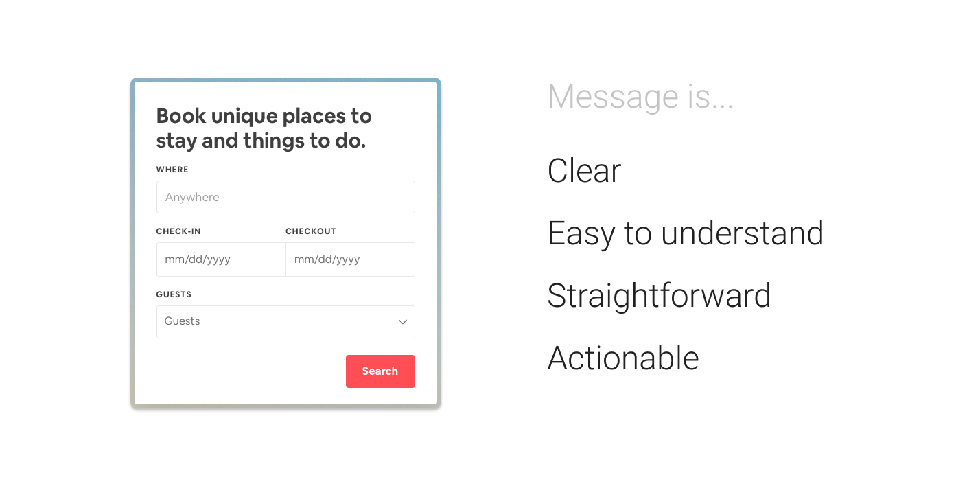
- AirBnB uses simple, clear and minimalistic design that reduces the cognitive load.
- AirBnB uses a Z pattern layout to "establish a concise visual hierarchy."
- AirBnB website attention heat maps.
- AirBnB uses priming effectively. They use relevant imagery that matches the target group well.
- AirBnB uses "simple, strong, and effective language" on their websites and apps.
- AirBnB tweaked its price setting layout to make it easier for new users to navigate that section of its website.

Research Strategy
We searched industry portals such as UX Design, user experience consultant websites such as PHD insights, and surveys by research agencies such as Measuring U to provide the pros and cons of the short-term rental platform user experience. However, we did not find much information specific to the user experience of renters versus homeowners.