Part
01
of one
Part
01
Health System Branding Case Studies
Key Takeaways
- Northwell Health reached "historic highs" in terms of customer awareness and satisfaction after rebranding from the namesake North Shore Long Island Jewish Health, with a current market awareness of 50%, a likelihood to recommend score in the "high 90s" and a net promoter score in the "45-47% range."
- AdventHealth enjoyed a 91% positive consumer response to its new branded house namesake and logo, and realized a "90% increase in clicks, 40% increase in impressions, 38% increase in CTR and top position in the rankings" for its new unified website.
- Catholic Healthcare West's rebranding to Dignity Health in 2012, Ascension Health's transition to Ascension in 2012 as well as Clarian Health's name change to Indiana University Heath in 2010 are three additional, if slightly dated, examples of successful health system branding/rebranding initiatives that corroborate the themes demonstrated within the more recent, preceding case studies.
Introduction
The research team has provided two case studies that detail the successful branding/rebranding of hospital-centered health systems in the United States. In curating these overviews, the research team took special care to provide only the most recent branding/rebranding initiatives available, as indicated by current media reporting, as well examples that specifically address the rebranding of traditionally religious-named hospital systems. Additionally, every attempt was made to identify examples that addressed all of the data points of interest, recognizing that the proprietary nature of information on marketing strategy and success metrics yielded mixed levels of detail.
Several additional branding/rebranding initiatives that appeared to be pertinent but that did not address the aforementioned criteria have been provided at the end of this brief, along with relevant reference material, for review as desired. In some cases, slightly dated information was included to add historic context and/or robustness to this research brief.
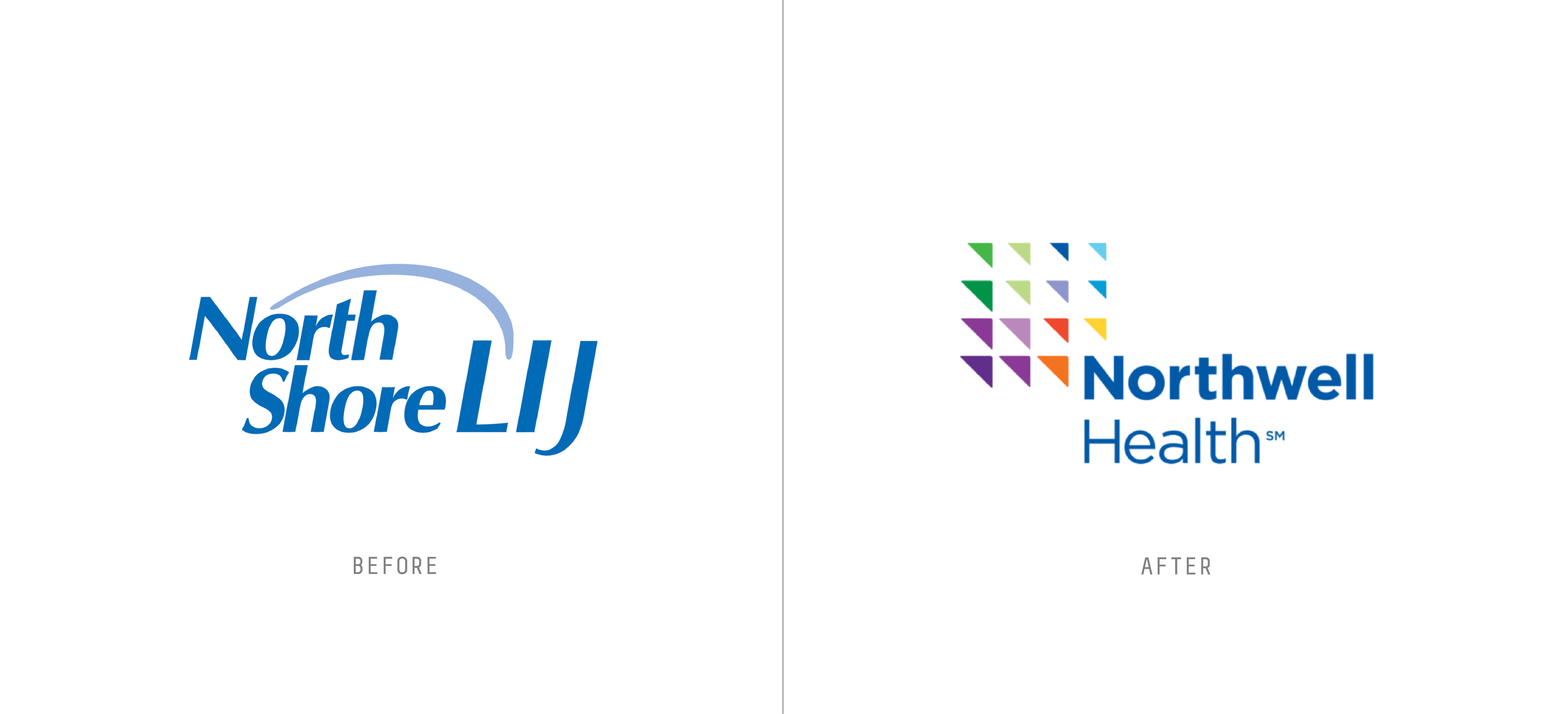
#1: North Shore Long Island Jewish Health to Northwell Health
Health System Overview
- Northwell Health is New York's largest health care provider, with 23 hospitals, over 830 outpatient facilities and an economic impact of $1.44 billion in its community of operation.
- The health services organization is also the largest private employer in the state, with more than 76,000 employees, including 3,800 physicians.
- According to the latest reporting by Northwell Health, it provides patient care to approximately two million individuals in its designated market area.
- Originally formed from two community-built hospitals — North Shore Hospital and Long Island Jewish Medical Center — the institution's former name was the byproduct of the institution's long history of growth through mergers and acquisitions.
Rebranding Strategy
- Prior to the successful launch of its rebranding effort in 2015, Northwell Health had attempted and failed for nearly eight years to pivot away from its historic namesake of North Shore Long Island Jewish Health.
- According to Northwell Health CEO Michael Dowling, CMO Ramon Soto and former Communications Director Terry Lynam, this former name was problematic for a variety of reasons:
- It was "cumbersome, often mispronounced or botched up in some way by news organizations, other healthcare organizations and the public," as well as the healthcare system's own employees.
- The name had no brand equity outside of the New York metro area.
- Even within the New York area, "the old name localized us as being too Long Island-focused, when the bulk of our organization has expanded beyond Long Island."
- The specific references within the name (e.g., geographic) "started really impacting physician recruitment."
- As a result, Northwell Health formally launched a brand identity system refresh comprised of a new name, logo and supporting signage/communications.
- The rebranding initiative was crafted to recognize that Northwell Health had transformed from a "group of hospitals" into a "behemoth with 23 hospitals, 685 outpatient practices and a vast network of long-term care, rehab, home care, hospice and urgent care services as well as its own school of medicine, school of graduate nursing/PA studies and research institution."
- It also supported the organization's growth focus of "expanding fiercely into Manhattan, into Westchester, into Staten Island, into Queens, Brooklyn," and "becoming highly visible and clearly understood within and beyond the New York metropolitan area."
Implementation: Name/Logo
- In order to identify a "highly visible and clearly understood" name and logo in the New York area, the organization completed an "onerous process" in partnership with Interbrand.
- Per Mr. Soto, Northwell Health first researched the historic naming conventions of health institutions across the country, and determined that there are currently six core schemas for healthcare system names, including religious affiliation, location, benefactor.
- Next, the organization brainstormed a list of six hundred potential names that met the health system's "baseline of criteria," however, most of these names had been trademarked.
- 15 viable candidates were ultimately available, of which seven received "a ton of market research" and were reviewed by the executive committee of the board.
- Northwell was ultimately selected, owing largely to "North," which offered a clear connection to the organization's history and provided a "rich storytelling ability."
- In parallel, the "generic medical look" of the former logo was updated with a "colorful, life-affirming identity incorporating upward-pointing arrows that evoke growth, progress, and positive change."
Implementation: Sub-Services
- Although Northwell Health's rebranding initiative was not applied differently to the organization's various support services (e.g., in-patient hospital care versus specialization), care was taken to respect the history at each of its locations.
- Specifically, Northwell Health made the decision to preserve the historic names of all of its facilities, such that the Northwell name appeared alongside the individual name of each site.
- According to Mr. Lynam, "keeping the names of the hospitals was in recognition of their unique histories within their respective communities because many of them date back, in some cases, 100-plus years...others have been in existence for 50, 60 even 80 years."
Implementation: Internal Marketing
- Well in advance of the rollout of such signage, however, Northwell Health devoted months if not years to engaging with its internal team members regarding the rationale and importance of the proposed rebranding effort.
- Per Mr. Lynam, Northwell's executive team appreciated that there was "a lot of close personal association with the old name, especially among employees who had been with the system for decades."
- As such, a variety of steps were taken to get buy-in internally before moving forward with external communications.
- For example, Northwell leadership circulated a "brand bus" that toured all of the health system's facilities to engage with employees on the reasons for the "massive change."
- Although Northwell health experienced "some pushback" among employees, there was "full awareness" as well as "improved acceptance" of the new name and logo by the end of the tour.
Implementation: External Marketing
- The external marketing associated with Northwell Health's rebranding was a "costly endeavor," according to Messers Soto and Lynam.
- The healthcare system spent "millions of dollars" just on the signage for its hospitals, outpatient facilities and vehicles.
- Notably, investments in temporary signage were made to ensure a smooth, unified rollout, recognizing that permanent signage would take time.
- In tandem, Northwell Health spent "well over ten million dollars a year" on consumer marketing for the new name.
- In support of this advertising, the organization monitored a panel of 2,000 consumers every month, which were leveraged to copy test "everything" and complete "head-to-head testing" of all ads versus competitors.
- Special attention was given to "graphic look and treatment" in each ad, with Mr. Soto stating "we wanted our stuff, our content, to be incredibly arresting, but visually look very different. So we use this parallax affect filming technique in how we developed commercials and put them out in the marketplace."
New York Customer Audience
- Beyond the larger goals of the brand identity system refresh, of which the "consumer piece was only a piece of the equation," Northwell Health looked to appeal to two key customer segments: (1) New Yorkers and (2) wellness customers.
- Recognizing the particularly competitive environment of New York, where Northwell Health would compete against "iconic institutions like NYU Langone, Mt. Sinai and New York Presbyterian," the healthcare system benchmarked the go-to-market models and branding approach for all relevant health systems in the area.
- This included both quantitative and qualitative analysis, with the support of experts including Interbrand and Monigle and modeling after consumer leaders such as Amazon.
- As part of this assessment, Northwell Health interviewed more than 3,000 New York consumers to understand their choice drivers, and surprisingly found that innovation was the "number one attribute that consumers were looking towards to build a relationship," rather than the more common priority placed on "best doctors, the latest procedures" in other markets.
- Considering these inputs, the healthcare system rolled out a storytelling approach to reach consumers, that included an "almost populist" tone and messaging that "we’re the health system for the everyday person."
Wellness Customer Audience
- In conjunction with targeting the greater New York customer base, Northwell Health also wanted to reach consumers who were interested in wellness services, and to have a "brand that reflected its greater mission not just to treat people, but to help them be and stay well."
- According to Mr. Soto, a key in selecting the Northwell Health name was the "well" piece, which signaled the system's commitment to "taking the journey with consumers in a very different way" and emphasizing wellness in its offerings.
- Beyond the selection of its new namesake, the organization also sought to reach the health and wellness segment of consumers by providing differentiated offerings and "doing a ton in the wellness space to make it authentic and bring it life."
- For example, Northwell Health became the "first health system to hire a Michelin star chef as the chief chef of the health system, and rolled out the tagline "food is health."
Success Metrics
- Specifically regarding Northwell Health's success in reaching these target consumer groups, Mr. Soto asserts that "the results speak for themselves." For example:
- The company is at "historic highs in terms of awareness" with a market awareness of 50%, which is approximately three times Northwell Health's closest competitor.
- Northwell Health's likelihood to recommend score is in the "high 90s" compared to a "low 80s" at the beginning of its rebranding journey.
- The organization's net promoter score is in the "45-47% range."
- Brand perception is "super solid" and the old name is never mentioned in customer focus groups.
- More generally within the healthcare marketplace, there was an "excited reception" for the company's new logo, and a general recognition that Northwell Health had "come out on the other side stronger for having [rebranded]."
- Meanwhile, from a financial perspective, Northwell Health saw its revenue grow by 15.7% over the last three reported years to $12.5 billion, while available reporting indicates that relative expenses/profitability have remained generally stable.
- Although the rebranding effort was not crafted to support the growth of one practice in particular, relevant growth data by specialty/division can be accessed here.
#2: Adventist Health System to AdventHealth

Health System Overview
- AdventHealth is a Christian, mission-based healthcare services provider that is sponsored by the Seventh-day Adventist Church and is "one of the nation’s largest faith-based health systems."
- The health system is led by its 50 hospitals and 30 clinics, employees 80,000 employees and services over 5 million patients annually in the South, West and Midwest United States.
- Prior to its rebranding initiative, AdventHealth formally operated as a unified company, but advertised each of its entities under a local brand, totaling approximately 30 distinct brands.

Rebranding Strategy
- As a result of the healthcare system's historic naming convention, AdventHealth VP of Marketing Sharon Line Clary asserts that "you wouldn’t know that we were part of this bigger organization, that we were a national company. We just looked like individual, localized companies."
- Recognizing this pain point, AdventHealth Central Florida CEO Daryl Tol asserts that the organization decided to move forward with a rebranding effort with two goals in mind:
- A desire to "bring everything together" under one brand identify and promise to customers, and
- An acknowledgment of the company's intention to be "part of the transformation of healthcare."
- Initially, the Adventist Health System began crafting the brand identity refresh and transition to a branded house purely as a transition of names, signage and logos, according to AdventHealth CEO Terry Shaw.
- However, when Mr. Shaw became CEO in 2016, he expanded the campaign to include a larger organizational transformation, into a "consumer-centric organization" with a unified customer promise.
- With this broader focus, AdventHealth leveraged its rebranding initiative to "become a more consumer-centric, connected and identifiable national system of care, enabling consumers to easily distinguish locations and services across its vast care network."
- In particular, unifying all locations under one name enabled AdventHealth to "strengthen its brand reputation," "raise broader brand awareness" and provide a seamless transition for customers within its healthcare network.
Implementation Overview
- The AdventHealth rebranding effort was led by Sharon Line Clary, the Vide President of Marketing, and a team of approximately one dozen individuals.
- Notably, the team started the rebranding process by consulting with "other health systems that had launched successful rebranding campaigns," such as Ascension (additional resources related to Ascension are available at the end of this brief).
Implementation: Name/Logo
- Specifically in crafting the new name and logo, AdventHealth invested in consumer research and "put our own preferences aside" in favor of what would appeal to the broadest consumer base.
- The name AdventHealth was identified because it "conveys an expectation of things to come in health care, while also drawing a strong connection to the organization’s rich Seventh-day Adventist roots."
- In parallel, the logo was crafted to highlight the "breadth and diversity" of the system of care, while also showcasing the Christian cross at its core and using a traditional "sans-serif typeface and blue and green color palette."
- After obtaining signoff from its sponsoring organization, the Seventh-day Adventist Church, AdventHealth found that the desired brand name was owned by a third party, and entered into negotiations to secure it.
- Unlike Northwell Health, the brand architecture was applied in a uniform fashion across all entities and practices areas "from hospitals to urgent care to doctors offices," and included the rollout of 13,000 building signs in addition to "screensavers and desktop backgrounds, email signatures, business cards, uniforms, lab coats and badges."
Implementation: Internal Communications
- In the years leading up to the formal brand reveal and signage rollout in 2019, AdventHeath "started to train and educate its internal family and bring them on board."
- Obtaining buy-in from employees related to the rebranding initiative had been one of the "biggest takeaways" from AdventHealth's conversations with other health systems.
- As such, the organization introduced an "internal culture and service initiative" named "The Whole Care Experience" to align its then 60,000 team members well ahead of the brand initiative.
- This included an "immersive training experience to align on its mission, vision, values and service standards so that consumers would have a consistent, exceptional whole-person care experience at each and every care location."
Implementation: Traditional Advertisements
- Once the internal AdventHealth team was aligned, the organization launched a "multi-million-dollar campaign," starting with a series of initial billboards and TV commercials.
- This was followed by a "bridge campaign" in November and December 2018, which had the goal to help "connect the old name with the new name."
- In January, alongside the formal rebranding announcement, AdventHealth shifted messaging to the Feel Whole marketing campaign, which included digital, print and television advertising.
- These placements were complimented with "several major partnerships" that "prominently featured the AdventHealth brand, including the AdventHealth Training Center, the Tampa Bay Buccaneers’ training facility; and DAYTONA Speedweeks Presented By AdventHealth, which is highlighted by the 61st annual DAYTONA 500."
- Mr. Shaw notes that the advertisements themselves marked a substantial "shift" for AdventHealth, which had traditionally featured its "physicians, buildings, accolades and technology" in television and print advertising.
- However, in an effort to be consistent with the consumer-centric ethos of the rebranding organizations, consumers were made the "stars" of AdventHealth's ads, which included commercials that "featured a bell choir of cancer survivors ringing in their cancer-free life."
Implementation: Digital Marketing
- Underpinning this external marketing effort was an investment in AdventHealth's digital communications infrastructure, including the introduction of a new, consumer-centric website: www.AdventHealth.com.
- This required the consolidation of over 800 websites and 35 different CMS platforms under a single brand and URL.
- The newly introduce website promised a "new easy-to-navigate user interface, enhanced search functionality, appointment scheduling capabilities, self-service billing and payment options and helpful content for health care consumers."
- Additionally, the health system launched the AdventHealth app, which "empowers users to take charge of their health care with a simple and intuitive interface that reminds patients of doctors’ appointments, notifies them about prescription refills, alerts them of new lab results...and offers patients convenient appointment scheduling and access to their medical records."
Key by Customer Audience(s)
- Although the target audience for AdventHealth's rebranding effort was broad-based, Mr. Shaw noted that particular attention was given to appealing to both religious as well as non-religious consumers.
- In particular, special care was taken in selecting the AdventHealth name itself to ensure that it "resonated" with customers outside of the Christian faith.
- Rather than the clear religious association of the healthcare system's prior namesake, AdventHealth was thought to appeal to consumers interested in a "healthy life and a new beginning."
- Despite this intended audience, however, AdventHealth also made it clear within rebranding materials that its affiliation with the Seventh-day Adventist Church would remain the same.
Success Metrics
- Considering the relative recency of the AdventHealth rebranding initiative, as well as the complicating impacts of the global pandemic, credible associated success metrics are somewhat limited.
- However, one year into its rebranding, AdventHealth reflected on its progress and confirmed that its approximately 30 hospital brands had successfully migrated to "one distinct identity," thereby "making it easier for consumers to distinguish AdventHealth’s locations and services across the network.
- Consistent with this achievement, a wide variety of leading, consumer engagement and satisfaction indicators confirm the efficacy of the designed rebranding program with its target audiences. Specifically:
- AdventHealth found that general consumer response to its new name, logo and associated marketing was overwhelmingly positive, at 91% of consumers in its target market(s).
- From a digital marketing perspective, AdventHealth also experienced growth for all pages including a "90% increase in clicks, 40% increase in impressions, 38% increase in CTR and top position in the rankings."
- Moreover, in the first three months of the pandemic, the health system's new brand attracted a 22% increase in impressions (an incremental 5.4 million impressions) as well as an 8% increase in clicks (an incremental 100,000 clicks).

- From a financial perspective, AdventHealth has seen its revenue grow by 13.8% on a quarterly basis to $3.3 billion for the first quarter of 2021, while available reporting indicates that relative expenses/profitability have remained generally stable.
- Moreover, in the eight months immediately following the rebranding effort, AdventHealth similarly reported that it was enjoying "fiscal stability and system growth, adding four new hospitals."
- Although the rebranding effort was not crafted to support the growth of one practice in particular, relevant growth data by specialty/division can be accessed here.
- Meanwhile, AdventHealth's annual reporting on community investment indicates a substantial increase in community engagement since the rebranding initiative was launched in early 2019, with total community investment expanding to $1.2 billion from $499 million.
Other Noteworthy Health System Branding/Rebranding Examples
- Catholic Healthcare West successfully rebranded to Dignity Health in 2012, at a time when it was the fifth-largest health system in the United States. Relevant discussion of the rebranding initiative by Dignity Health is available at these links (one, two), while related media coverage can be accessed at these links (one, two).
- Ascension Health became Ascension starting in 2012 to facilitate its transition from a holding company of separate autonomous health systems into a unified operating company. Statements on the rebranding from Ascension are available at these links (one, two), while associated media reporting can be accessed here.
- Clarian Health rebranded to Indiana University Heath in 2010 in order to enhance the health system's ability to compete nationally. Reporting on the details of the rebranding initiative is available at these links (one, two).
Research Strategy
For this research on the successful branding/rebranding of hospital-centered health systems in the United States dated, the research team leveraged the most reputable sources of information available in the public domain, including corporate reporting (e.g., Northwell Health 2019 Annual Report), corporate press releases (e.g., AdventHealth rebranding press release), executive interviews (e.g., interview with Northwell Health CMO Ramon Soto) and credible media reporting (e.g., Healthcare Finance). In some cases, slightly dated information was included to add historic context and/or robustness to this research brief.