Part
01
of one
Part
01
Non Profit Landing Pages
Key Takeaways
- A non-profit landing page should have one to two Calls to Action buttons at the most.
- The best non-profit landing pages are visual, simple, include a bold but simple and relevant color scheme, one font, and little text.
- To maximize the search engine optimization of the landing page, check the keywords that fellow environmental organizations are using.
Introduction
We've provided five best practices for non-profit landing pages, below. Each best practice includes a description of what it is, some supporting data where available, instructions and suggestions, and example non-profit pages.
Feature Action Items
- What: Most non-profits and NGOs would like site visitors to take some kind of action, be it donations, continuing to raise awareness, reading a report, writing to a politician, signing a petition, subscribing to a newsletter, following the group on social media, organizing a local branch, getting in touch, or other actions. It's important to prioritize one or two of these, and feature them prominently on the landing page.
- While the rule for business landing pages is one offer per page, that translates to one main action for the landing page for a non-profit. Multiple actions can decrease conversions (ie taking action) by up to 266%.
- How: Action items can often go in the left or right-hand column of the landing page, with the main message and visual taking up much of the top portion of the page. A button for the main action can be integrated into the navigation bar or the header - this way it will be visible on all other pages visited.
- Calls to action should be as buttons, icons, graphics, or large text. Many of the Nature Conservancy's calls-to-action, for example, are green buttons. Buttons should be simple, bold colors, and simple fonts (rather than flowy or stylish ones).
- Use simple action words like "donate," "download," or "request" rather than phrases, passive tense, or even nouns. You can add a word for value proposition or urgency, like "now!" or "today!". Other more creative action phrases include, "Take action," "Change a life," "Join the revolution."
- People are put off by contact forms (especially when there isn't a clear benefit), and by irrelevant questions, like age. Reducing form fields from 11 to four can increase actions by 120%.
- Examples: The first image is from Conservation International, and both the subscribe and donate buttons are clearly visible in the navigation bar, and a second donate button is in the header image. The second image from the Global Fund for Women shows how the donate button stands out (bright purple), as does the button for awareness raising (read more - also purple). In both cases, huge images dominate the landing page, rather than text. In the third image, Farm Animal Welfare has used the right-hand column and images with text for their calls to action.


Color scheme
- What: The color scheme and design should be simple, creative (to attract attention and be memorable), and also relevant to the organization's missions - eg greens and blues for an environmental organization.
- A distinct color scheme can increase web recognition by 80%. Sites with dark color schemes grow slightly faster than sites with light schemes.
- How: For environmental websites, green color schemes are an obvious choice. Those schemes can use green as a starting point, but complement with various tones. This website has eight color scheme ideas for environmental sites. Brown and white go great with green (eg the Real Happiness website).
- Double the Donation recommends "2-3 brights and a few neutrals." They also recommend one single font, and one shape for buttons.
- To ensure the website is accessible, high contrasting colors are important for visually impaired readers. You can use this tool to test the colors.
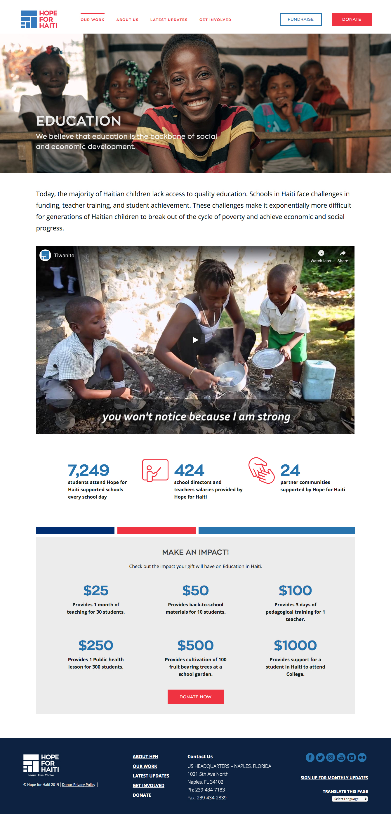
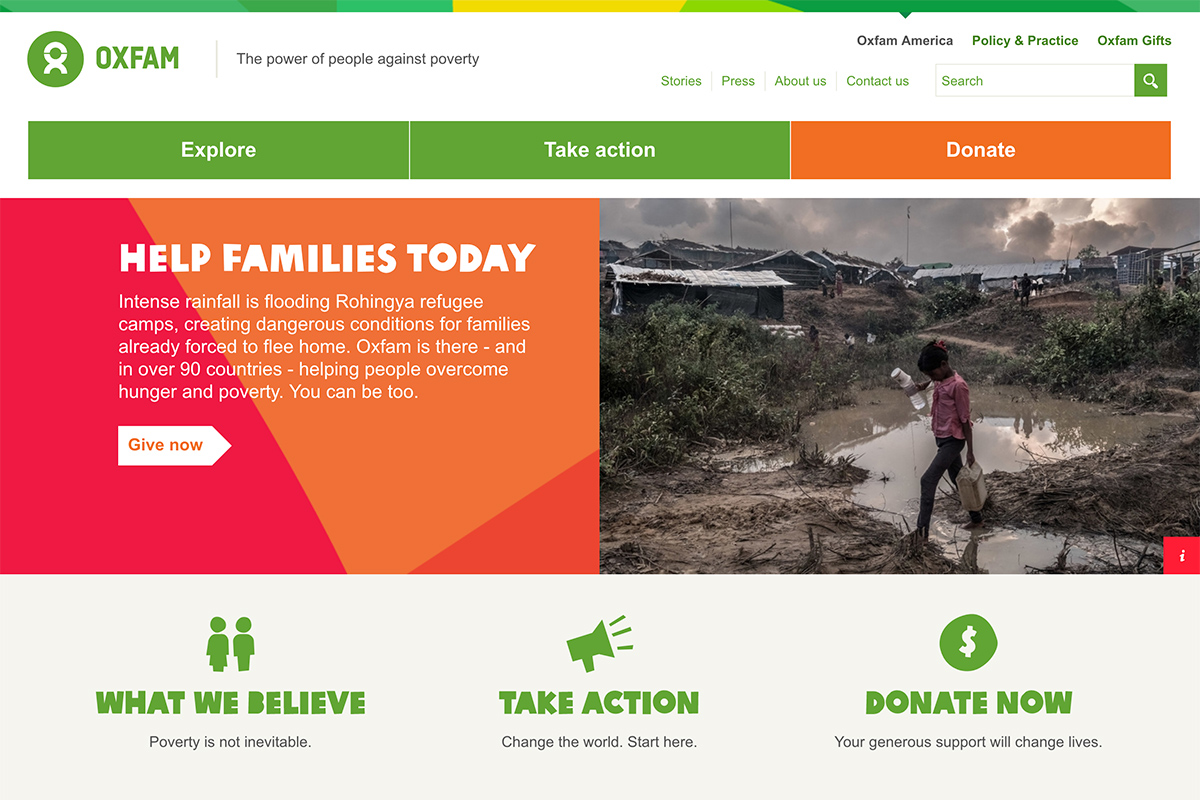
- Examples: In the first image, for Hope for Haiti, the blue, red and white color scheme mimic Haiti's flag. In the second image, Oxfam's bold, bright color palette gives the site energy and vibrancy, without being too complicated. In the third, the color scheme for Charity Water is a very simple blue and mauve-grey.

Prioritize images and video
- What: Concise, clear messaging combined with large images and / or video is important. Large chunks of text on a landing page can contribute to information overload and overwhelm a first-time visitor.
- Why: People's brains process visuals 60,000 times faster than they do text. Explainer videos or testimonials increase credibility and build trust, and can increase action taking by 86%.
- How: For FreshSparks, the best non-profit sites, "tell a story for brand building, share the impact on their cause, engage users and solicit action." Often one powerful image can do the latter two things. Images can be photographs, infographics, graphic videos, vlogs, or other videos.
- Photos should be impactful, high quality, and reasonably unique. Beyond environmental photos, photos of staff, of communities served by the organization, and infographics are also great.
- The top image and the headline are crucial. You only have 8 seconds to make an impression (before the visitor clicks away).
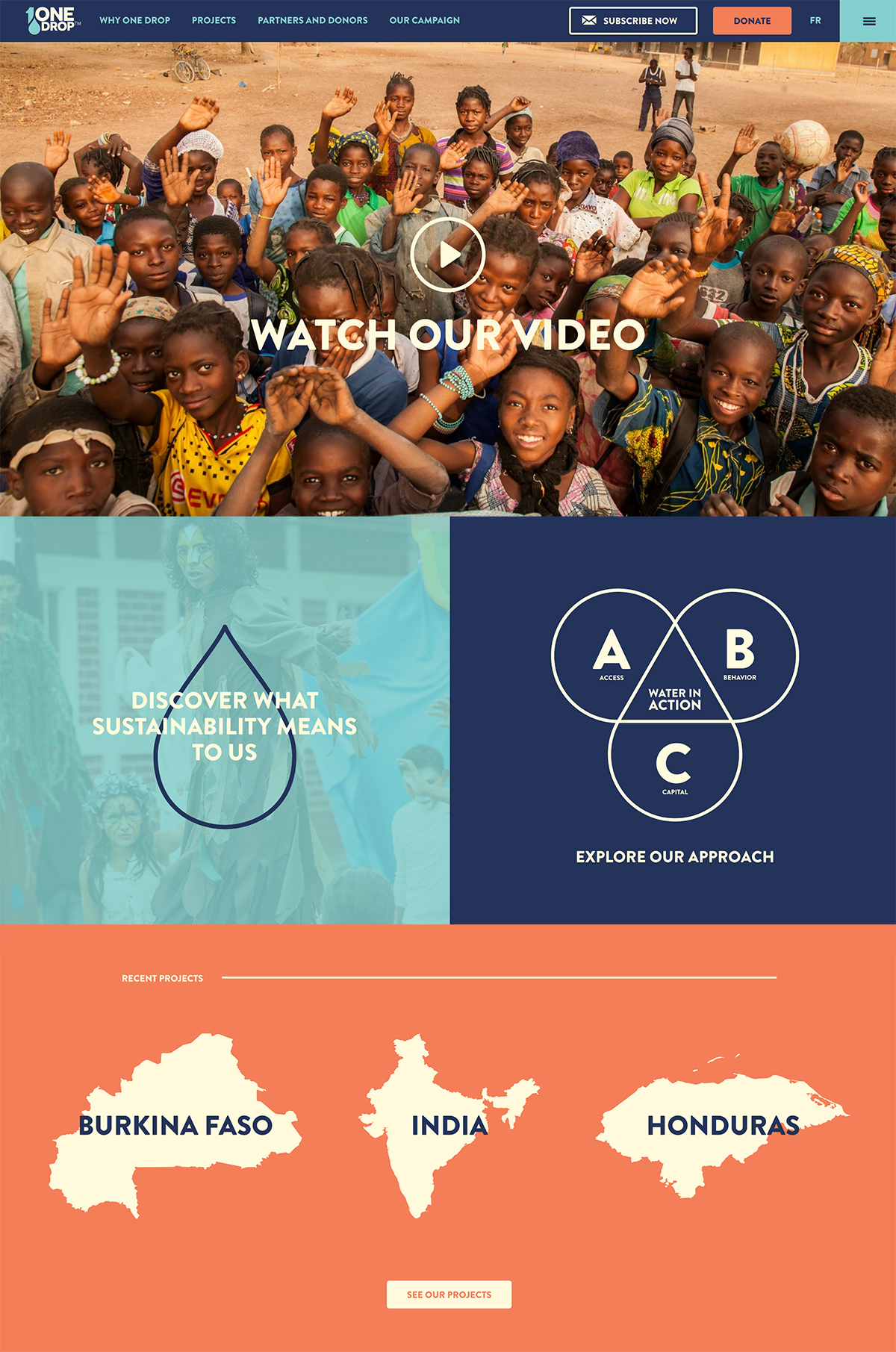
- Examples: Conservation International uses a rotating huge header image, and each new "screen" includes a new image, a new key environmental demand, and a new action that can be taken. Tent, a site for refugees, uses a huge banner image with brief mission text in white, followed by four key focuses of the organization - each as a large colored button, then a short video which provides an overview of the issue. The images used are emotional, humanizing, and bold. In the landing page below, One Drop uses an image-video as their header, then large, colourful, simple icons for their main topics.
Simple navigation and menus
- What: Especially as people are now browsing much more on their phones (68.1% of website visits last year, globally, were from mobile devices) , simple menus are essential.
- Some 80% of a mobile visitor’s attention is focused on the top of the page. That means that the first image is the most important, the navigation shouldn't distract from the message, and that once the visitor's attention has been caught, they are more likely to scroll down and read more of the page.
- How: Drop-down menus should be avoided, or kept to a minimum. The navigation bar should have 5 key sections or less, if possible. There should be a navigation bar at the top of the landing page. Having a lot of menu options, columns, text, and a lack of white space can overwhelm a visitor or be distracting from the main point of the page.
- Navigation should be intuitive (visitors find their way easily around the site). That means easy, simple words for menu options and headings, one navigation bar that is visible on every page, avoiding jargon, and potentially a search bar. Visitors will leave a website if they can't find what they need very quickly.
- Examples: In the first image, Feeding America has no drop-down menus. The National Wildlife Foundation does have drop-down menus, but with a single column, a simple green menu, with single words that act like buttons. In the second image, the menu just has three core functions, in the top right - the simplicity of the landing page saw Fresh Sparks categorize this page as one of the best.

SEO optimization
- What: As email open rates and social media clicks to websites are declining, it is important to use the right keywords on the landing page, so as to attract readers organically through searches.
- How: Use Google Analytics and tools like Alexa and Similar Web to understand where your visitors are coming from and what they are searching to get to your site. Install an SSL Certificate on your site so that Google doesn't classify it as unsafe. Some 30% of nonprofit, NGO, and charity websites globally don't have an SSL Certificate.
- Use a blog or news section that is easily accessible from the landing page, in order to ensure you constantly have new content, as well as a diversity of content that can bring readers to your site. Regular updates / blogs / cause trends / news stories / events about the organization or issue can potentially generate 67% more leads.
- Use your organization's keywords consistently (and repetitively) in headings and the body of text.
- Beyond the main words your organization uses in its tagline, mission, and press releases, you can also research competitors, or fellow organizations for the words they use a lot on their landing pages, use long-tail keywords (more specific keywords or phrases) and use keyword tools to check the most common keywords used to get to a site. For example, using Similar Web, the most common keywords users have used in searches to land on the Green Peace site, are: climate change, deforestation, and carbon footprint.
- Make sure the site is responsive (works on any kind of device). Google likely won't list it if it isn't, and you'll lose a lot of readers.
- Examples: Green Peace includes "Updates" (ie news stories) on its landing page.
Research Strategy
We chose the above best practices based on the utility of the practice for an environmental non-profit. That is, how much impact the practice will have, and how relevant it is to non-profit landing pages specifically (not for donation pages).
We looked for studies and reports with more objective data on landing pages, and found that there weren't any. However, there is a lot of business-oriented data created by marketing companies who have an interest in convincing readers of the benefits of using their services. While their data often doesn't apply to non-profits, some insights, like which elements and features have more impact, can be helpful and have been included, where relevant, here.